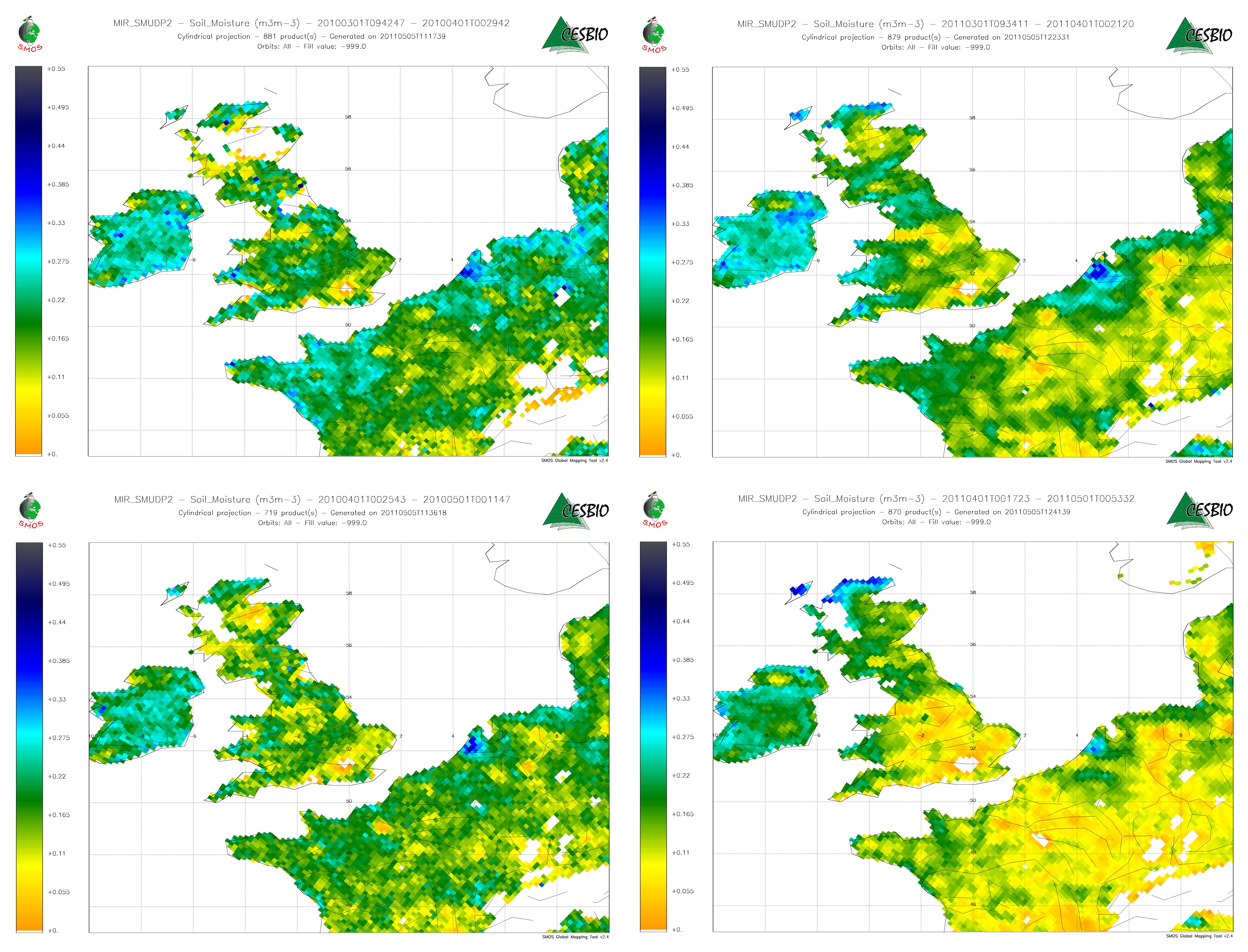
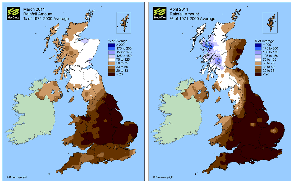
Southern UK and France appear to be sharing the same concern regarding water. Soil moisture maps from SMOS clearly shows very dry conditions in most part of England and Wales. We can see on monthly mean maps since beginning of 2011 the soils getting drier and drier.

Monthly average soil moisture maps for january (top left), february (top right), march (bottom left) and april (bottom right)
Moreover, if we compare these maps to what was measured at the same period in 2010, we can clearly observe how drier we are this year. This is shown below for march and april, along with histogram of differences.
Monthly average soil moisture map differences (2011-2010) for march (left) and april (right)
These maps show good agreement with analysis from UK Met Office, as evidenced by the comparison of the differences above and the anomaly maps below:
Rainfall anomaly for march (left) and april (right)
I must also be noted that april 2010 was already quite a dry month, in the same regions.SMOS will keep monitoring soil moisture for a very decisive month of may…

Leave a Reply

Your email address will not be published. Required fields are marked *

This site uses Akismet to reduce spam. Learn how your comment data is processed.